Monday, 28 March 2011

Gordon Matta Clarke

I have been reading about Grodon Matta-Clark and there are many things which I can relate to with my own work, as he was not only interested in visuals and appearance but also the community and how architecture can be created to revitalise it.

An extract from a written piece regarding his project Days End.
'it would seem within the rights of an artist or any other person for that matter to enter such a premises with a desire to improve the property, to transform the structure in the midst of its ugly criminal state into a place of interest, fascination and value.'

Remarks from an interview in 1977:
'why hang things on the wall when the wall itself is so much more a challenging medium?... A simple cut or series of cuts acts as a powerful drawing device able to redefine spatial situations and structural components.... There is a kind of complexity that comes from taking an otherwise completely normal, conventional, albeit anonymous situation and redefining it, retranslating it into overlapping and multiple readings of conditions past and present. Each building generates its own unique situation.'
I can directly relate to this quote, in not only what I believe but also what I am trying to achieve  in nearly all my work. It specifically relates to this project in terms of redefining  the space through a series of unexpected holes which will develop in my structure but also in terms of layering information to create a new and dynamic environment which draws upon the past. 


I can identify points of interest and relevance with most of Gordon Matta-Clark's images but these are specifically relevant to what I'm trying to create for 3b, a point at which you can stand and then another view can be opened up to you. The idea of a view within a few is something I began to investigate for 3a and for 3b would like to resolve - I think it's going to be a changing view, something which appears and changes over time so that your view from one point may change over the life cycle of the proposed installation period of two years. 

 Bronx Floors 1972 and 1973
 Bronx Floors Four way wall 1973
 Office Baroque 1977
Splitting 1974

Gordon Matta Clark's collaged images of views led me to create some photoshop composition combining drawing and photographs.

Saturday, 26 March 2011

Exploring film and projection

Currently I am thinking that I will project films by Ronni Horn, I like the idea of using something linked to the earth, and her water films are beautiful yet informative. This again links back to the idea of being bombarded with information much like you are when driving, particularly around central london.

26.03.11

I've been trying to do some drawings which represent the theme of my project better - using delicate forms using this idea of history dissolving. I think it could be useful to use this (or possibly something else as a theme for all my drawings so they start to speak about a particular language.

Thursday, 24 March 2011

Wall structures and route options

These drawing take the plan and add some useful information about how my proposal works to it, in terms of interaction form different parties.

I have created a series of narratives of thoughts and conversations by visitors to the site, proposing the feeling and views that might be felt by different visitors. 

The route a car can take through my proposed intervention. 
Some of the different routes a pedestrian can take within the proposed space. The pedestrian will be able to wander through small gaps in the walls through which a cars inhabitants can only look. 
Layering the maps to show interaction within the space. 

Composition, wall plan and layered information to show interaction between cars, pedestrians and the spatial arrangement of the walls.

Wednesday, 23 March 2011

Susan Hiller Exhibition Tate Britain

Early Design Representations

Sketch model trying to show how the walls would be broken up to allow pedestrian to cross routes within the main car route - allowing for further interaction. The model was successful in that the lighting highlights the gaps much as is the aim for the proposal, although as it was made straight onto the plan the suggested drawn routes make this a little confusing to understand. It helped me to see the plan in 3d and the next progression needs to be to think about wall thicknesses which will also affect the lighting conditions. 


reference - Ugo Rondinone


Routes

The routes will reflect pedestrian movement through the site when opperating as a petrol station. As Peter Eisenmann does, I want to add layers of information to the site - layering physically what is there ephemirally.

 ped route map

The pedestrian routes (and hence forgotten marganalised spaces which a pedestrian uses) will be manipulated by calculating turning circles within the space, to make it practical. This act of layering and manipulating information is reflecting the history of the site physically. These will then provide my route for the cars.

turning circle map


floor plan

Tuesday, 22 March 2011

Lecture - Tomoko Azuni + T.N.A. Design Studio


This lecture by Tomoko Azumi was a brief run through some of her major works. I really liked the way she designs around processes and manufacturing even within mass production, and in that way is sustainable. 

Using dying traditions to create new furniture, she designed a modern chair from an ancient technique used in a specific part of Italy, this close relationship with craftsmen is something I really appreciate from designers, I guess in the same way that I don't like to eat food that I don't know where its' come from. 

I recognised her birds house from tent London, but again here hearing about the process I am able to appreciate the final piece more, an object made entirely from offcuts, but which has been well designed and had new details added. I really like this idea of transformation weather applied to products or buildings it's something i feel I really identify with. 


She had also been in Japan when the earthquake hit, and as a Japanese national felt that she wanted to do something. She is thinking about setting up an online forum where designers can create 'kits and instructions' for pieces of furniture which the people affected can create from what they have around them. This sensitive yet useful response to the earthquake is the sort of thing I wish I saw happening more often, particularly from influential designers. I am always very interested by the work done by the firm Architecture for Humanity, who are often working in areas affected by disasters. 


Reference - Jannis Kounellis


Routes

Time aspect

Using my sketch models with different ratios of material to plaster, I investigated how the material may act after weathering due to the british climate. I filmed the destruction of these models using water pressure. This idea of a structure which dissolves over time to leave the area in its' original state almost 2 years later., speaks about sustainability but also the use f space, in terms of short term use as well as major building works for long term use.

Here are a few of my films:

Sunday, 20 March 2011

Exploring texture

I need to design the plan for a space which you can be guided through, so just 1 route, a simp,e route, the route itself doesn't matter it's the journey that matters. I have been thinking about this in terms of the plan and flow through the space, but I also wanted to start moving forward in terms of design ideas.

Taking the literal idea of white walls, which can be manipulated and differ in surface led me straight to the foundry. It's about time I began to build something exciting - I have missed being in the workshop and I think the impact has been evident through my work.

I have made a cast of one of the possible wall forms which would sit within the space. I have begun to dissect these by carving into the surface - thinking about how art could interact with a textured surface leads to film for me - the idea of projecting onto a moving/ changing surface will mean the art/film will also be moving/changing. This is now moving towards a dynamic plan for the space which is my overall aim, a dynamic space which induces to interaction.


These images show some of the surfaces I have worked into the walls - these over time would erode further or dissolve (change form).


I have made an number of test models - adding different constituents to my plaster mix to weaken it therefore building for its' destruction. I'm trying to only add waste material in order to also find an environmentally friendly solution - my main aim being that it's not edible for city inhabitants (such as rodents). I want something thats effected by time and weather not that is destroyed by birds and foxes. The idea of dissolving walls is poetic and thats what I want to create, something that is affected by nature over time, much like my project last year.

Friday, 18 March 2011

Old Harry Rocks

I visited Old Harry Rocks near Poole, I really love the way they have been carved by nature (the sea) and the different textures that have been created as the limestone is eroded. For my gallery I wan tit to begin with the textures that will hopeful with the aid of the british weather, be weathered further to create new and interesting forms as they morph and then dissolve over time.


 The surfaces that have been created fascinate me, how the same force (the sea) can create a number of different patterns and weaknesses within the rock creates such a dynamic landscape.

Wednesday, 16 March 2011

Vertical surface

After visiting a number of different galleries and analysing the layouts, the aspect still in my mind was that they were all just acting as display cabinets for the work on show. This got me thinking back to when i visited the guggenheim in NYC, I was so fascinated by Frank Lloyd Wrights masterpiece that I have no recollection of the work I went to see. For me the whole gallery even from the external approach was all about the building and the experience of being guided through it. Moving through the core not noticing everything that was passing but just being mesmerised by the passage through space. 

I decided that rather than just becoming a curator in effect, I wanted to explore this idea of experience driven design. Already this idea of 'drive thru art' is about experience but how can this be exaggerated to the point that after experiencing the space you develop a spatial memory that evokes feelings, rather than being guided by whats on the walls - cant the walls become the guide. This is already the case in a number of galleries the layout is indusive towards flow. 

Wednesday, 9 March 2011

Intervening in the Petrol Station


CORK ST Waddington Galleries.

CORK ST Alan Cristea Gallery

Alexia Goethe Gallery - Jacques Villegle, Trajectoire Urbaine.


I visited several of the Mayfair Galleries as part of my research - I love that they are all so close together yet each very much has it's own identity. I had never been to the Alexia Goethe Gallery and was drawn in by the bold exhibition currently on. 

This was the flyer I picked up. This work particularly caught my eye in the context of the brief I have just written. Its bold graphics and juxtaposed images are composed from found materials, therefore speaking about whats in cities for us to view, and then he changes the view by decollaging them. Something similar to what I want to do take something you see everyday (the petrol station) and layer another aspect of the city into it.

This work caught my eye because it relates to that language of motoring graphics which bombard you, the way he has composed these, layering up posters that are part of everyday life reinforces that idea of being bombarded by consumerism.

........

Finalised 3B BRIEF


Writing my own brief for 3b

Initial Draft

This was an interesting exercise as it made me think about how I want to approach my project. I actually found this really hard without having any feedback from 3A, I wasn't sure if I should keep pushing the same idea or do something new. Then after reading through some old briefs I remembered just how vague some of them are, so I defined an outline of what I want o achieve whilst leaving the specifics open. (the best I could do with no feedback). 

Initial Draft. 

I aim to develop a resolution for my proposal which looks at different elements. The form which my resolution takes will need to be carefully investigated but also the materials which could be used to create it. Furthermore an understanding of how humans will interact with the space will be an important aspect also. 

Taking elements seen at Ecobuild and applying them to my design, really investigating material qualities;
-        Using the workshop to experiment here. It would be nice to create models which really depict an element of design, whilst testing ideas simultaneously. Here using models as part of the design process I would be picking up the ethos of the platform.

-        Through test models develop scenarios which could be applied at a larger scale, and to represent this a dialogue between models, design and drawing will need to develop. Drawings need to be pushed to really express feelings and environments.

The form is likely to derive from layering information and translating this into design. This was my proposal at the end of 3A. Investigating the forgotten spaces – the spaces a human uses with a petrol station, and translating these into a design. This will allow me to create a new environment within an area already associated with a particular use, drawing on the past to create a new commentary for the space. And hopefully this will encourage new use of the space.
‘space was rewoven, dismantled and reconnected and subjected to technologies’  Esther Leslie.

Carlo Scarpa, Santa Caterina Complex
‘there is the continual enlargement of the range of materials Scarpa used in his compositions, to the point incorporating anomalous events and abstract sensations in them. In his museum interiors, for instance, his designs unfold their commentary around the historical objects, themselves intended, moreover, to become part of the substance of the composition.’ Francesco Del Co and Giuseppe Mazzarioi.

Looking at interventions and the idea of finding them, the idea of something tangible making visible the invisible or forgotten elements from the site.

How people will interact with the new environment I will be creating will also need to be considered. I would like to look at interactive design and push the idea of a structure which could be moulded by the inhabitant. For instance aspects which could be moved to reveal further areas is something I have considered in 3A.

Drawing on my research and initial ideas for 3A I would like to develop a design relatively quickly so that I allow myself time to depict it clearly. I want my work to tell the story of how it would feel as a pedestrian to experience the area. I think it is important to allow enough time to fully explore and illustrate my final proposal so that the project can easily be read. 

Anthony McCall Exhibition.


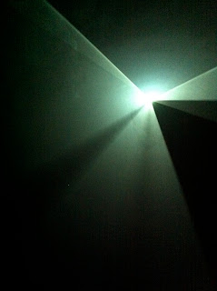
Anthony McCall is one of my favourite artists his work is simple yet so effective, and I like the fact it's exhibited without too much pretence. Through lighting and smoke he creates strong boundaries - which are all to do with how you perceive space as there is nothing physical stopping you. Although when you cross these thresholds something feels strange. 

When standing within these forms the effect when you look up is fantastic - I couldn't really capture it on film, it's more like a sensation. The way the smoke interacts with the light cuts at harsh angles yet feels so soft, and actually rather calming. 

BARBICAN Laurie Anderson, Trisha Brown and Gordon Matta- Clarke.

I thoroughly enjoyed this exhibition, for me the interactive and performance elements added so much to what was already a great exhibition.  Gordon Matta -Clarke is one of my favourite artists so I was really looking forward to this.

The exhibition consisted of a trio of artists who were hugely influential in 1970's New York. They explored the realm outside the ordinary, by taking work out of it's known context into the city streets for example walking up the sides of buildings. This way of bringing about new ideas by challenging what already exists and changing its' viewpoint is one of the main concerns of my work and was a theme which heavily featured in my thesis. Take this current project for example I'm taking a petrol station, an icon with strong associations and trying to make people view it and interact with it in a different way, thus opening up the city.

This trio worked in what is now SoHO in New York, they worked to transform their community through art, by making the place vibrant. But also using the existing fabric to create their work and accordingly addressing urban problems. This is what I want to develop to do as a designer work to twist the existing to create something outstanding.


In the lower part of the gallery space the performance elements for me represented 'live interaction'. I particularly enjoyed 'Planes' by Trisha Brown in which people moved across a wall whilst a projection fell on the wall. This created a series of illusions suggesting that the dancers were 'free falling and changing scale'.  This idea of projecting onto something which is moving could be an interesting idea to carry forward into my project, it definitely creates a sense of illusion, which could be interesting to work with. 

Sketch whilst watching Floor of the Forest by Trisha Brown. I found this piece really poetic, the slow careful movements of the human body through a web of clothes and ropes. hanging from clothes watching the shapes the body formed when suspended from everyday items of clothing and the shadows forms was really beautiful. It was an interesting piece which also worked as an illusion of sorts an everyday activity of getting dressed viewed vertically is nothing spectacular, yet turn it 90° and it becomes something unique and sculptural. 

Sunday, 6 March 2011

Hermes Article (Financial Times magazine 05.03.11)

This article was about how Hermes (fashion) had managed to increase it's profit quite dramatically through the period surrounding the credit crunch, by keeping their driving force of craftsmanship solid throughout the period and not looking to lower costs through mass production. 

I was particularly drawn to this image of a new store - it looks really striking and also has links to the willow project we have just completed at Ecobuild. I love the organic forms against the solid lines of the building, I also like the aspect of partial views - this is something very interesting to consider particularly in reference to retail. 
The article explained that as the brand has recently moved to China, they have taken quite a unique route in order to do this 'take the Hermes vision and put it in a different country' so that products are almost entirely Chinese. This allows them to create cultural products but with the brands twist at the high end of the market , rather than going to China to manufacture similar products at a lower price. I really like this view of respecting craftsmanship, as it seems to be dying out which is such a shame. Often I find that if someone explains the process of how something was made to me it makes it so much more special and this is what Hermes are standing by as a firm, I'm really glad to hear this.

Another thing I read which links to what we are doing in platform 5, is how they tackle recycling and appeal to eco- friendly customers. They produced a collection of one off's that are made from 'discarded Hermes materials' such as leather and towels; and these have proved to be so popular that they all sold within 3 weeks.

Friday, 4 March 2011

Ecobuild Conference 02.03.11

THE ART OF PLACE AND THE PLACE OF ART.
JAY MERRICK, ERIC PARRY, PATRICK LYNCH, STEPHEN BAYLEY.


There were a few things I found which I thought were innovative and good design that I would love to see working. 
1. PAVEGEN - this product is pretty self explanatory, the weight and frequency of urban footfall is used to generate electricity which powers street lights. Therefore the light are only on when they need to be and they are powered in an eco-friendly way. 


This would be an excellent thing to be used in our project in Peckham as we are proposing such a scheme. It's a shame they are such a new company or they might have had the funds available to sponsor us. 

Ecobuild Exhibition, 1-3March 2011.