Saturday, 26 February 2011

Peckham news and ecobuild.

It's been an incredibly busy week, but lots of exciting things have happened. I had the meeting with the council in Peckham, they really liked the design, but there is still loads to do. They explained the outline of the process we need to follow and said t would be great to get this up in time for the sumer art gallery in the car park and I totally agree. 

First we need to gather a focus group, they suggested approaching a variety of groups within Peckham; from young people through charities and Peckham space to the police streets, Peckham vision team and the council. Peckham Space is supposed to have links to UAL so I am trying to investigate this through Chelsea. The focus group is the first step, as they said it will give our project more power if it has backing from the local community and authorities which totally makes sense.\

I found the whole meeting experience great to find people within the council who were actually excited about public art ( I wasn't sure they existed). There are so many groups and links out there that they made us aware of which is great, hopefully some of them will help to support us through this project. 

Our enormous lorry and its measly contents at ecobuild. 

Second development is the ecobuild structure - see blog - http://platform-5.tumblr.com/- it's confusing writing 2 blogs at the moment. Yesterday was a huge development for this project as the components were delivered to site and we got to see the real site. It's really exciting to see an exhibition hall pretty much empty - I've only ever been into these places when they are packed with trade-stands and people. It looks quite daunting at the moment and there was not much action on site yesterday so I expect today will be much more busy. Currently there are builders, cranes and power tolls on site - I think it's great that we ( a bunch of students) are working alongside them creating a structure without the use of tools, thats the amazing thing about this whole project the low technology design that looks really beautiful. 

The view from our pavilion on Friday. 

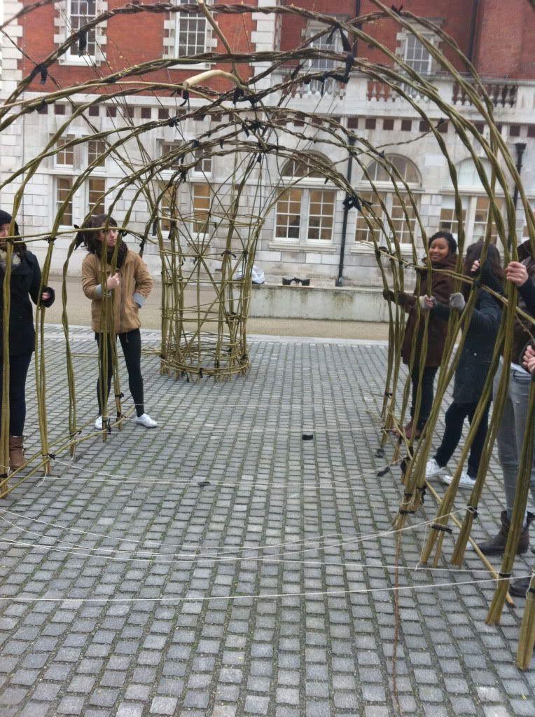
The second tunnel goes up!

Sunday, 20 February 2011

echarrison.co.uk

I've built myself a website so now I have an online portfolio, it's not perfect yet but i'll get there.

Ecobuild 2011

Platform 5 are building a pavilion for Ecobuild 2011 from willow and speedo. This has been hard work and not even half way yet but it's really exciting to finally be able to build something 1:1 scale. I think everyone is really enjoying the building aspect of it - something we rarely get a chance to do at Chelsea unfortunately.

Friday afternoon we all braved the cold to assemble the initial structure  - we soon found where the weaknesses are!

I am actually in charge of publicising the build, and we have another blog running specifically for platform 5, which is http://platform-5.tumblr.com/. Here you can follow our daily activity as the show draws closer. 

Wednesday, 16 February 2011

Peckham news

We finally have a meeting with the council about Peckham and it sounds exciting, the cultural manager, planning advisor and streets solutions people will all be there. This also means I only have a few days to work out the budget and weather or not this is even possible. Now i'm starting to realise how easy everything is at uni , when you don't have to spend half the day calling suppliers. I need someone with inside knowledge!

I'm excited though it's taken an awfully long time to get to this point so I really hope it goes well.

Also my Ecobuild pass arrived today.

Thursday, 10 February 2011

2b proposal


Proposal: walk-through motion gallery space. Levels create suggested paths which lead you through views. Catching glimpses of 'live art' from obscured viewpoints. The vertical strips would be movable like the speedo tests. 


Pen and Ink  3D Figure and Ground drawing of proposed elements. 

For me the association with petrol stations and creating something drive- through are too obvious, additionally my design work is about creating a better experience for the pedestrian therefore I propose a walk-through space. When I say walk-through I start thinking something you experience without stopping could be interesting.

This is an installation at Chicago airport that you travel through on a conveyer belt walkway. 


Whilst this project looks interesting I don't think I want my structure to move itself, I think if it can become a space which guides you to move through it that would allow different conditions to be created. Currently I am thinking I could develop a space which could be a 'street art' gallery or performance space - I like the idea of moving past action and catching glimpses of it but never needing to stop to appreciate it, effectively there would be 2 works as the space itself would act like an interactive installation.

Hayward Gallery

Historical links

Looking through some research books, I came across these images of how they used to raise cars on a system of pumps, an interesting thing to consider when looking at changes in height. 

Deterritorialization of pedestrian interact

Initial proposal models - layering forms and 'blurring' to recreate the known environment routes. Beginning to try and visualise how a form may develop from the map - I want the form to be a series of paths which interlink and provide 'moments' of visibility through a network of layers. 


Peter Eisenman. - must finish

I just bought a new book about 'blurring' - he describes this as a technique to 'alter the conditions of the traditional' by recalibrating history to create new forms.


He talks about the 'expected experience of space' this is something I am trying to explore within my project, both thorough the idea of memory in reference to Ecobuild but also in terms of creating an obstruction which questions this. This is one of my main interests within design,


PECKHAM - self initiated project

Myself and April are working in collaboration with Rosie who has agreed to sponsor our project (providing funding and expertise). We are applying for planning permission and imminently having a meeting with the council about building this project in Peckham. 

Following on from the summer when we had hoped to get an installation built and after approaching the council they relocated us. Peckham was where they suggested - an area where they are focusing on a long term plan and looking for a series of small improvements in the short term. We chose this long alleyway behind the cinema, as it is very hostile to the pedestrian, we want to provide an installation which will help to make people feel more comfortable in the area. The lady at the council has one overriding concern that whatever we do will be hard to vandalise. Therefore we are proposing 2 elements:

1. Subtle lighting built into the wall which responds to movement, therefore illuminating your path but also notifying you if someone else is further down the path. 

2. A structure made from concave mirrors which sits on the corner; showing you if someone is around the corner and therefore eliminating that scary feeling of suspense as you approach the corner. This would sit above the wall, therefore making it harder to reach and vandalise. 

Thursday, 3 February 2011

Good Reads


These are some good books I've read recently - I particularly recommend Michael de Certeau.

Wednesday, 2 February 2011

Trip to the top of the Gherkin

Today I was lucky enough to attend a breakfast at the top of the Gherkin, and I took a little detour to the very top and it was completely empty - perfect, maybe this had something to do with the fact it was 7.30 am.  The structure is so powerful up close and the finish and use of materials is very crisp, the structure was reflected on the floor surface which I loved.

 Unfortunately it was quite foggy, although as the sun began to break through I got some great photos that look almost  post apocalyptic. The structure provides an excellent frame for the surroundings also.
Another thing I enjoyed was being opposite the 'half built' shard, I love watching buildings as they are being constructed and I could get an excellent view. 

When I was looking out over the city I couldn't help but think about the great timing and the relationship this building has to my project. The way the structure of the Gherkin can be seen to both frame and interrupt your view is something I have been trying to explore albeit with more malleable materials. This use of a simple pattern has worked fantastically both for the interior views and the exterior structure of the strangely shaped London landmark.

......

new direction

Since receiving the brief for this project about designing a pavilion I have been struggling to come up with a design, proving to me that most commonly form derives from function. To design a functionless 'thing' is incredibly hard - I started to think about installation design but then realised these have functions too - much like interventions.  After struggling with this obstacle for months and finally discussing it with Joy I realised I need to think of a function for the space - exactly what I have been trying not to do all project.

Joy suggested trying to combine a new idea or interest with my research into forms and materials. Pretty much immediately I had a direction - I only wish I had this conversation months ago. I  am interested in interventions and reinventing spaces to heighten the experience of the modern day flanneur  (my thesis in a nutshell). Through my site research and observations I have noticed a lot of creative people passing my site and also many children. So this led me to think about some type of exhibition space. It's strange as one of the first things I thought when I jumped over the fence is that it would be a great place for skateboarders - it's already noisy so they wouldn't be disturbing anyone.

I like the idea of creating hanging screens which could be used to show work or direct people. I think the manipulation of routes through the space could be interesting to investigate
quick concept sketch. 

Tuesday, 1 February 2011

screens

Drawing exploring layers and screens, I chose to use a map - thinking about an information point or similar, it would also provide great shadows.
cutting out even just a small section of this took me ages. 

This installation by Tord Boontje is very delicate and hangs beautifully in the natural environment, but what if this organic structure were to be juxtaposed against a man made geometric landscape? This could be something interesting to investigate within my site, especially due to the flower market being next door.